Harmonisation with Discarded Fabrics
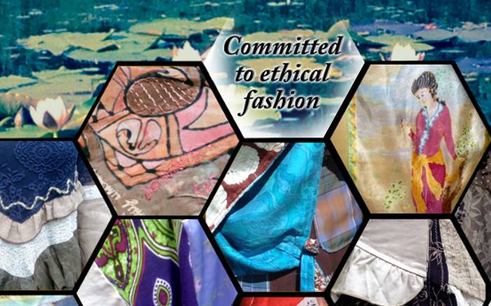
Design inspiration comes from seeing themes evolve between disparate fabric prints and colours, rescued from charity/thrift shops, to be recreated into a new unique garment artwork.
As an artist and textile designer, I have a keen eye for the illustration and patterns in textile prints. I source those which appeal to me, variously of classical floral illustrative, geometric, and astral. A combination of all these together with coordinating plain colours makes a good patchwork.
Not all prints are of personal favourite by themselves, but depending on their colours, I will see a way they would contrast or blend within a theme. A dress full of rose bouquets can be cut up to introduce patch areas highlighting the best flowers. A smaller patchwork piece/area of fabric can become more special than the full repeated print area.
Cotton lace tops (often cotton/acrylic mix) are another good find, as they can be layered over other colours. Most synthetic lace fabrics also surprisingly take up plant dye to some extent, which removes any stark whiteness, too brilliant for patches amongst colours.
I usually choose a starting point of a print, or a part of a garment. then make a pile with other colours and prints (5 is usually sufficient to start with). As you do this, one choice may be removed and replaced with another, as the combined effect literally 'shouts' too dark, too light, etc., depending on the theme in mind. The most subtle patchwork is when the overall effect is of fabrics of a similar tone; i.e. nothing too light, nor too dark, on its own. I often do include black with a strong colour collection, due to its fashion favouritism, but am more careful with lighter tones and darks mixed, when making patch-worked garments using panels larger than traditional patchwork.
Silk Painting Inspirations
Some garments have my hand painted silk panels. The print designs in each fabric collection may suggest a new design to be developed further, using their elements to create a silk painted panel, or I may simply copy some elements combined with other images of my own. Colour mixing dyes to match the existing prints is an essential skill. My silks, Habotai or Ahimsa, are base dyed with natural plants, in pastels and mostly golds. In 2024 I'm experimenting with clamp dyeing backgrounds and making dye paints from plants and roots to use instead of commercial chemical dyes.
Contact me for enquiries or commissions: amelia-jane-designs@protonmail.com
