Experimental Silk Bleaching and Painting with Plant Dyes
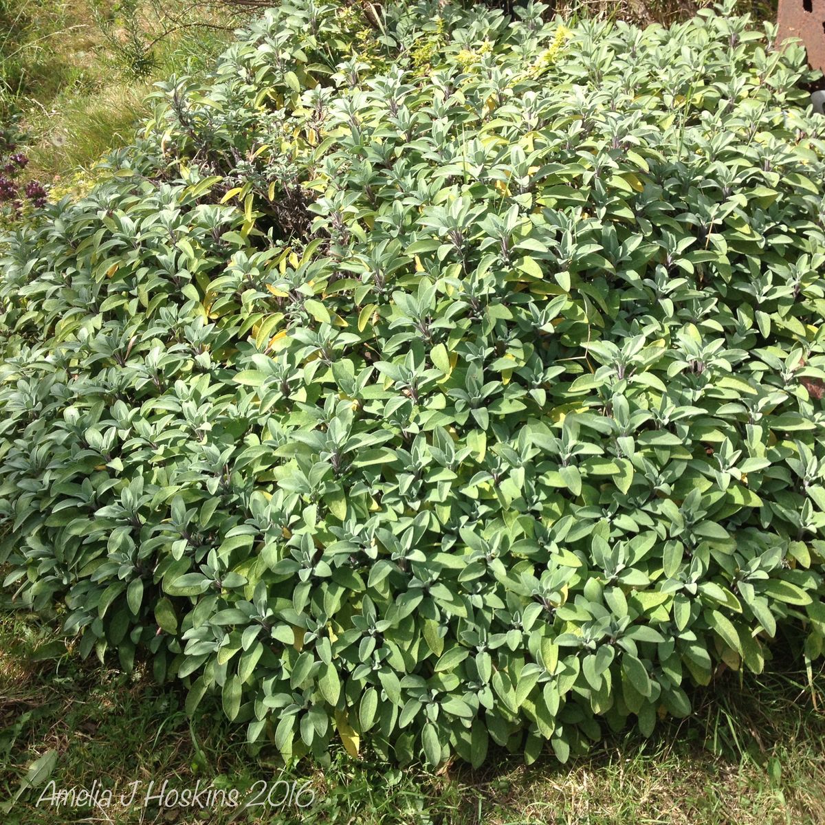
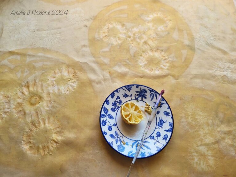
This is my first attempt at using plant dyes (rather than commercial ones) on previously plant-dyed silk. Silk dyed with rosehips was rather pale, so I over-dyed silk Habotai 10 with sage. Previous triskele designs done in soya wax (as resist) were only dull yellow and darker after the sage bath, so I bleached out further, brushing lemon juice around in rough and larger manner to give vague paler guide.
- Lemon juice with brush
- De-colourant (commercial product) thinned with water, applied brush.


Lemon juice was brushed around the linear borders of triskelles, and the tie dyed star-shapes in background. It seems to have removed the sage, but not the original peachy rosehip, which shows through. This is a very useful tool to use as design outlines or rough out areas. It needs testing on different plant dyes and see what colour results.
Lemon juice bleaching looked yellow when wet (sage dye dissolving?). It produced only slightly paler areas, about 30% less of the ground colour, but gives an outline to follow later. Triskeles were followed by placing tracing of design underneath silk, and sketching over on the silk with water soluble pens (available in blue and purple). To emphasize paleness, the de-colourant paste (thinned 50/50) was used to give light outlines: to see the whole design, and to allow for colour to be added over. I iron steamed the de-colourant areas to dissolve.
A new shape - a torus in line form was added. Light star shapes were originally tie dyed resist at original dying so they are pale in the torus two centres.

At this stage, perfection isn't so important as I prefer to have some unevenness, and some overlapping of layers. In this instance, the overlapping of transparent torus over the original triskeles is an experiment. Silk was rinsed in mild soapy water after the ironing/fixing out of the de-colourant.
*. *. *. *. *
OVER PAINTING SILK WITH NATURAL DYES - Experimental design ideas to practice with dyes
Next, water based gutta was applied by both pipette and brush over the lines around and within the triskeles and the torus. Gutta plain, and gutta with added dye Madder, Woad and Mimosa Brown thinned, were used for thin and thicker lines around outside of triskeles. Madder, woad and mimosa dyes were painted with brush within the outlined design areas.
Lemon juice successfully faded out some triskele colours painted too bright behind the 'torus' area. A 'ghost effect' is produced. Angels were placed within the torus ovals, utilising the pale tie-died star forms. De colourant had also been used beforehand to lighten the 'angel wings' area. (After steaming wings went rather yellow, so de colourant needed again).


STEAMING OF NATURAL DYE PAINTED 'TRISKELES AND TORUS ANGELS'
Experimental result from 2 hrs steaming. About 70% of natural pigment seemed to stay in tact with a faded overall 'aged' effect. This could work well used in abstract designs, where clear outlines not needed. The gutta steamed out completely, leaving the dyes behind. The lines within the torus are quite a good effect. Madder stayed fairly well, woad quite paler, and gold-brown colours used in the gutta line application seem to have infused the whole areas. Turmeric was painted in some areas around designs, which may have spread out adding an unwanted yellow overall.

Steamed Silk Experimental Design
Strength of colour was lost; faded effect is interesting and can be utilised for 'antique' designs.
The many different lines of gutta outlines, and infill dyed lines create a subtle interesting effect, even though the brighter contrasting colour outlines are lost.
Madder turned duller, ruddy brownish, and other gold and brown outlines merged into each other. Woad blue faded to pale. (woad without additive)
Actually a good background for embroidery.
[Photographed in evening lamp light]


De-colourant repainted over areas originally lighter
Due to the loss of colour contrast, I used chemical decolourant discharge paste over some main circle lines and the angels. I forgot to use it weaker strength and got a yellowish result. The first result was aesthetically better.
-
Some torus rings, triskeles, celtic knots and angel wings lightened in rough large brushed areas.
-
Areas are steam ironed to activate discharge
Coloured details can be added again over top, possibly with synthetic dyes due to the detailed colour needed for angels, bird and lion. Other discharge pastes may be tried over for this experimental piece. Eventually I hope the piece will be usable as centre piece to a patchwork quilt.

CONCLUSION: Natural dyes are good for background areas.
Gutta outlines (to prevent dye spread) were coloured with natural dye, which mostly faded out after steaming. Their wobbly outlines (created by gutta pipette and nib application), gives an interest better than exact lines.
Lines as feature colour were faded. MADDER kept colour best in the outlines, and will be useful for silk design outlines.
Coloured brush strokes can be overlaid for intermixed tones.